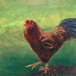
It's Hip to be Square

When I was younger, being 'square' meant you were a bit of a nerd and stuck in the mud of doing the same of old things. [Cue the song by Huey Lewis "Hip to be Square"]. Boy, I am dating myself - is that still even a saying? 😊 Sometimes I definitely still fit the definition above. Maybe that’s part of why I like a square format for my paintings so often.
Choosing the shape and size are two of the most important design decisions an artist makes when starting a composition. Neither can easily be altered once you start and the shape lays down the first four lines of the piece: the edges. The shape of the panel needs to fit the composition and can dramatically impact delivery of the message of the piece.
There are four basic shapes that are traditionally used for artwork: the horizontal rectangle, vertical rectangle, an elongated rectangle and the square. The horizontal rectangle is the most traditional, due in part to our human field of perception. Its horizontal nature relates to the earth’s surface and horizon, creating a grounded and calming effect. It is by far the most popular format for painting the landscape. When turned vertically, the rectangle relates to the human head and is commonly referred to as the portrait format. When the rectangle is elongated beyond the standard rectangle, a sweeping panorama can be created. The eye pans back and forth across the design, imparting expansiveness (I really like this shape too!). The square is the most ambiguous, creating a visual tension.
Personally, I often find that I gravitate to working in the square. I like the balance as well as the compositional challenge that its symmetry offers. The basic rules of placement don’t apply in the same way they do to in a more traditional rectangular shape. The canvas can’t just be divided into even thirds with the dissecting lines used as a guide for easy placement of the center of interest for the piece (an artist's most common compositional trick). Our brain likes a little asymmetry though, and things can easily be too evenly balanced on a square panel. The tension this dilemma creates compositionally is a challenge to which I am often drawn.
Here are some other examples of pieces I have done in a square format:
I’m curious to hear - What size and shape pieces are you most often drawn to when you look at artwork?
Please feel free to share this with anyone you think might enjoy this message or my art!


